
The centre asked for a refresh, not a rebrand. Members knew the three figures in the old logo, so we kept them and refreshed everything around them: a cleaner Nord-Bridge mark in which the centre figure’s arms form the bridge, a compact NB55 mark for tight and square spaces, a brighter palette of Bridge Blue, Friendship Red and Community Green, and the warm, readable Poppins and Nunito typefaces. NB55 also became the centre’s short name and new address, nb55.ca, backed by a brand guide that staff and partners can follow.
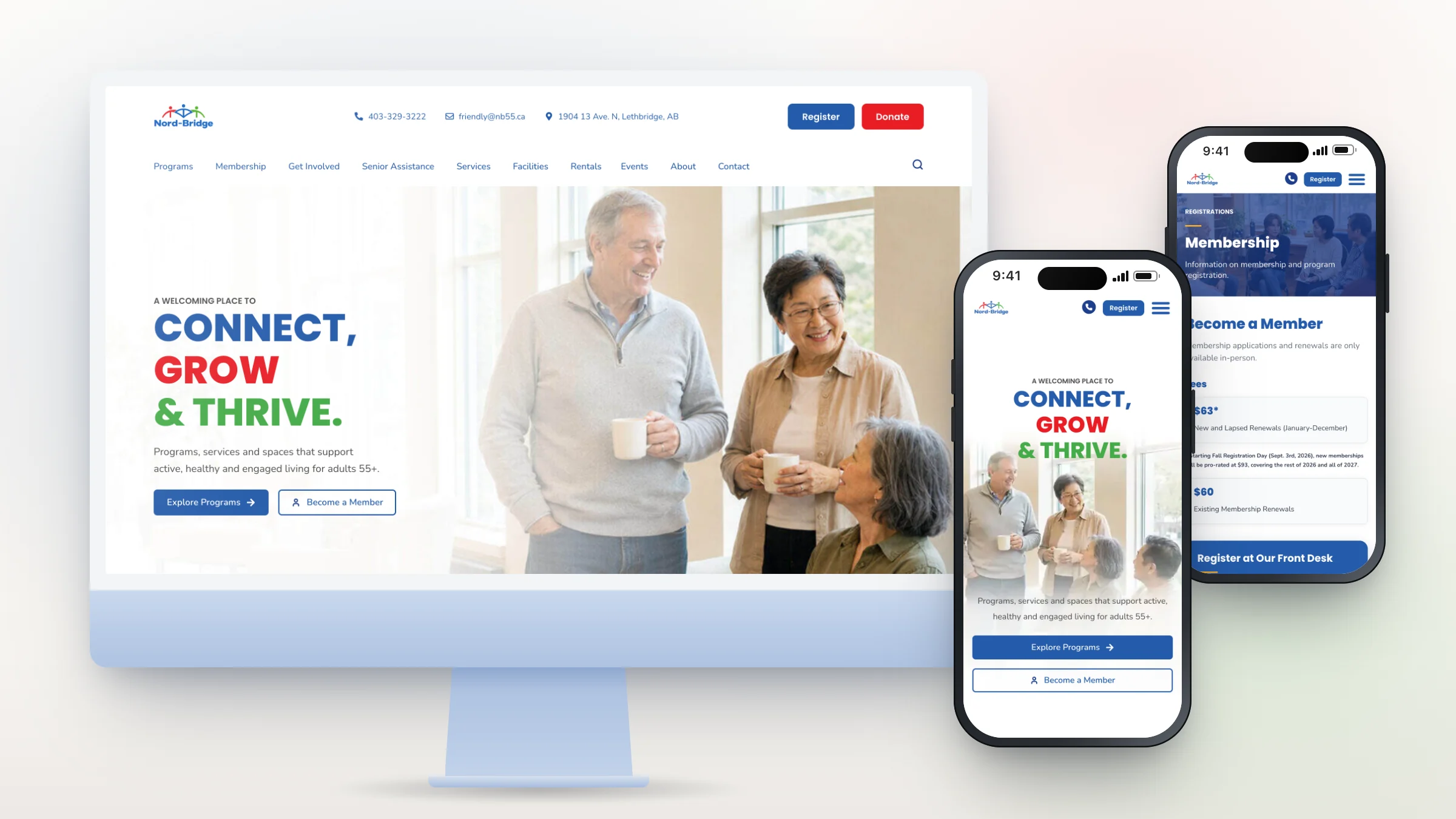
The website was rebuilt around what members come to do. A single row of clearly labelled sections, with short, well-spaced menus beneath them, replaces the old nested dropdowns. The phone number and the Register and Donate buttons stay in the header on every page, linking straight to the centre’s online registration and donation pages. Type is large and high-contrast without feeling oversized, because the centre’s members are increasingly in their 60s and 70s and the team wanted the site to feel fresh and current.
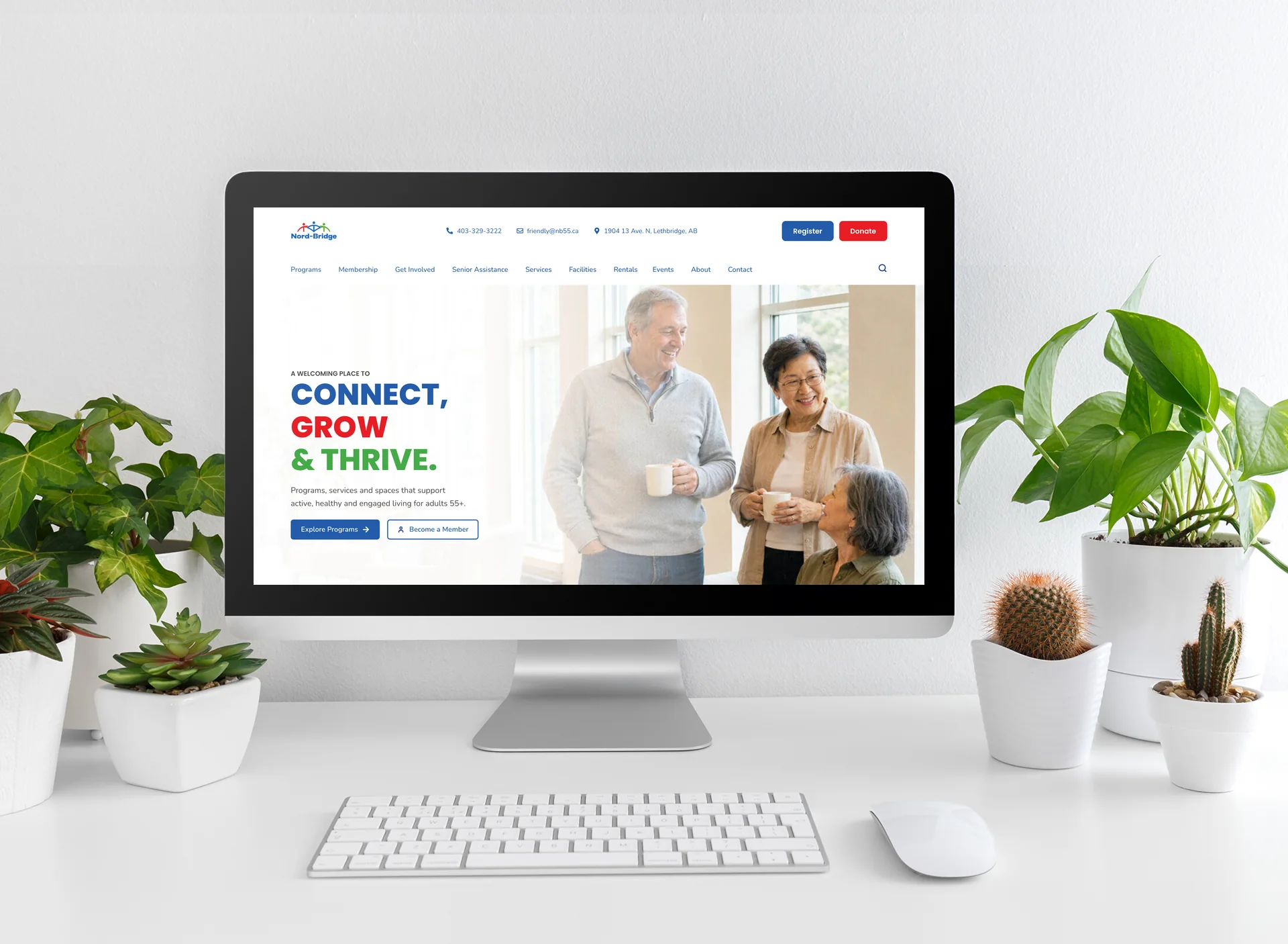
We worked in the open with the centre’s team: a shared moodboard first, then the homepage, then every inner page, with short video walkthroughs between calls so staff could review in their own time.
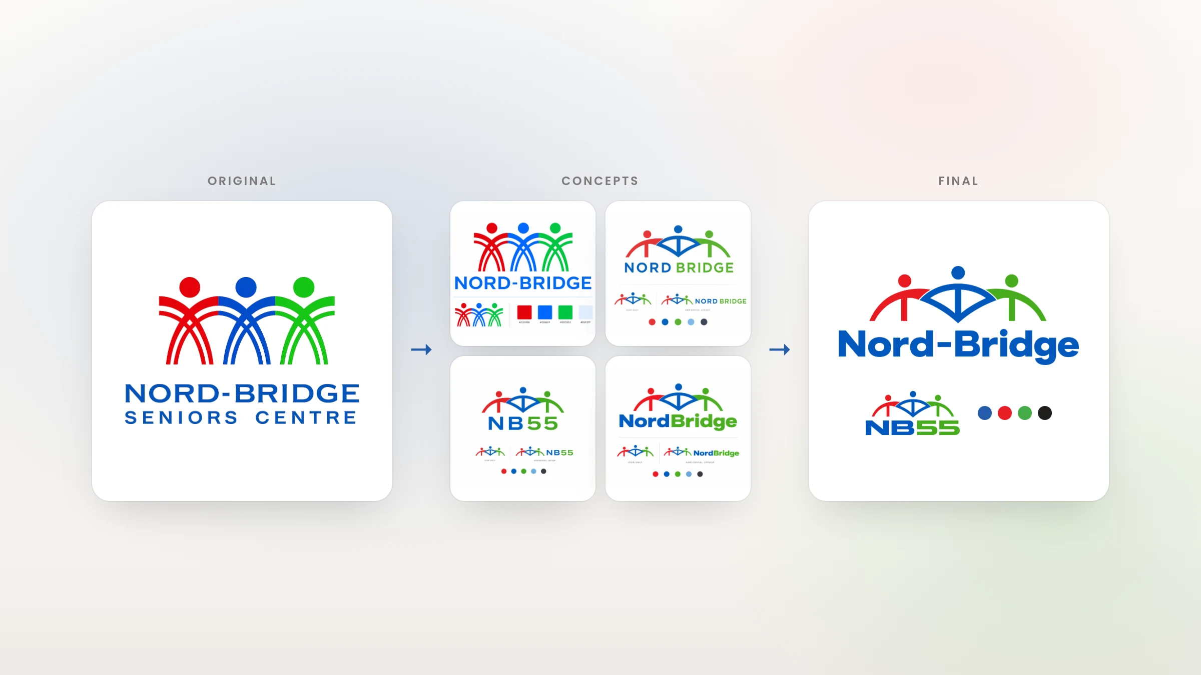
The logo designer started from the original three-figure logo and explored refresh concepts while the website was being designed. The final Nord-Bridge mark keeps the three figures in red, blue and green, with the centre figure’s arms forming the bridge, and the NB55 mark handles tight and square spaces. The brief summed up the goal: move from “out of date but familiar” to “fresh and new, make people curious about us.”

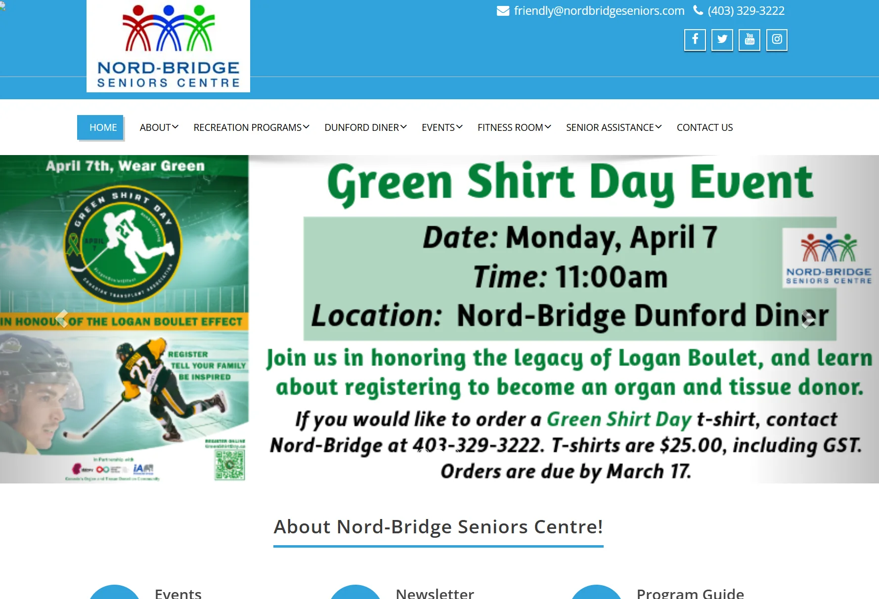
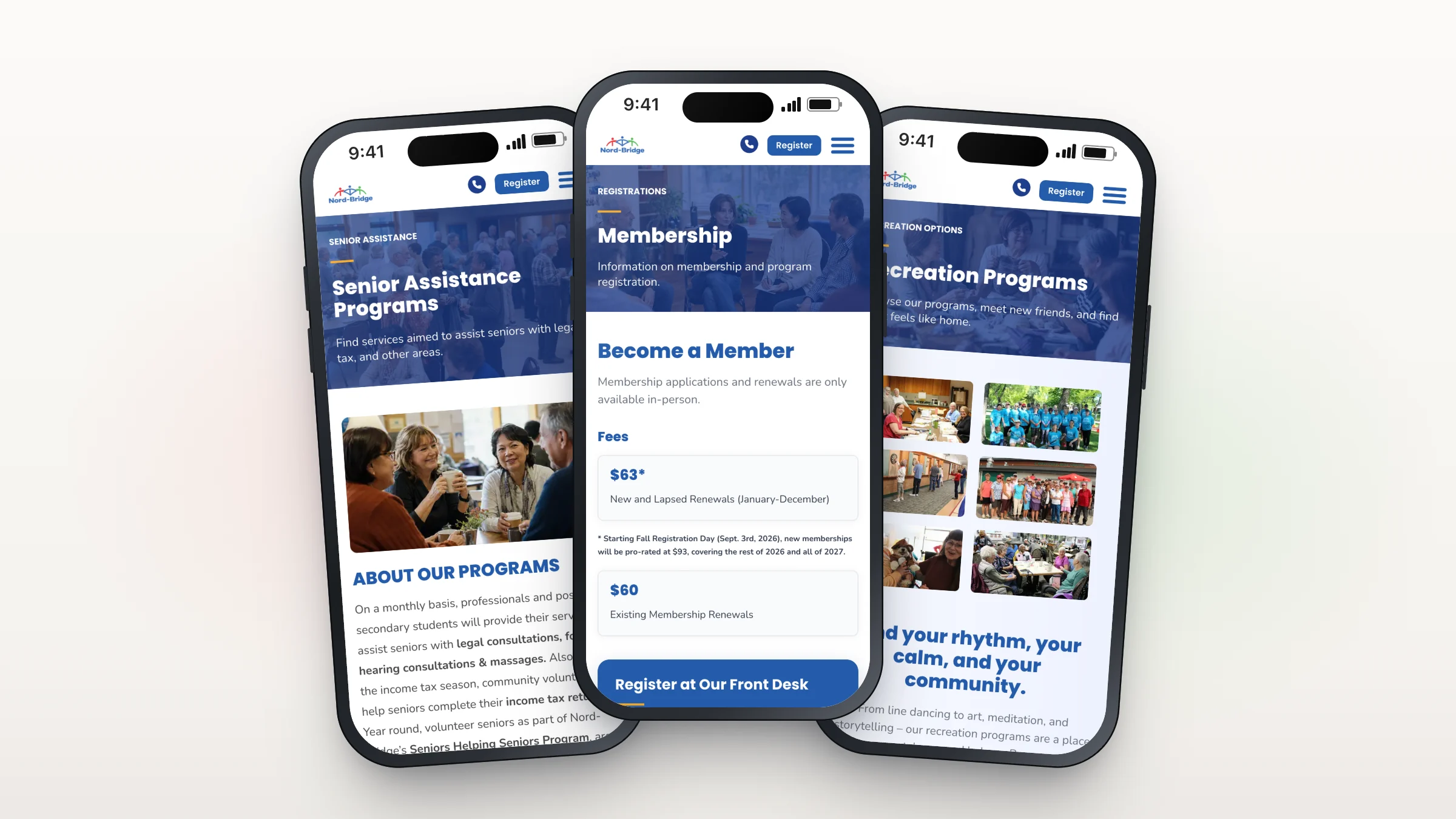
At kick-off, the director of programming described the problem: “as soon as you get on your phone… even if you’re just trying to go to newsletters, it’s really hard to click on the right tab.” Every page was designed and checked at phone size first, with a compact header that keeps the phone number and Register button in reach, one menu button and large tap targets. The before image is an archived copy of the old mobile homepage.
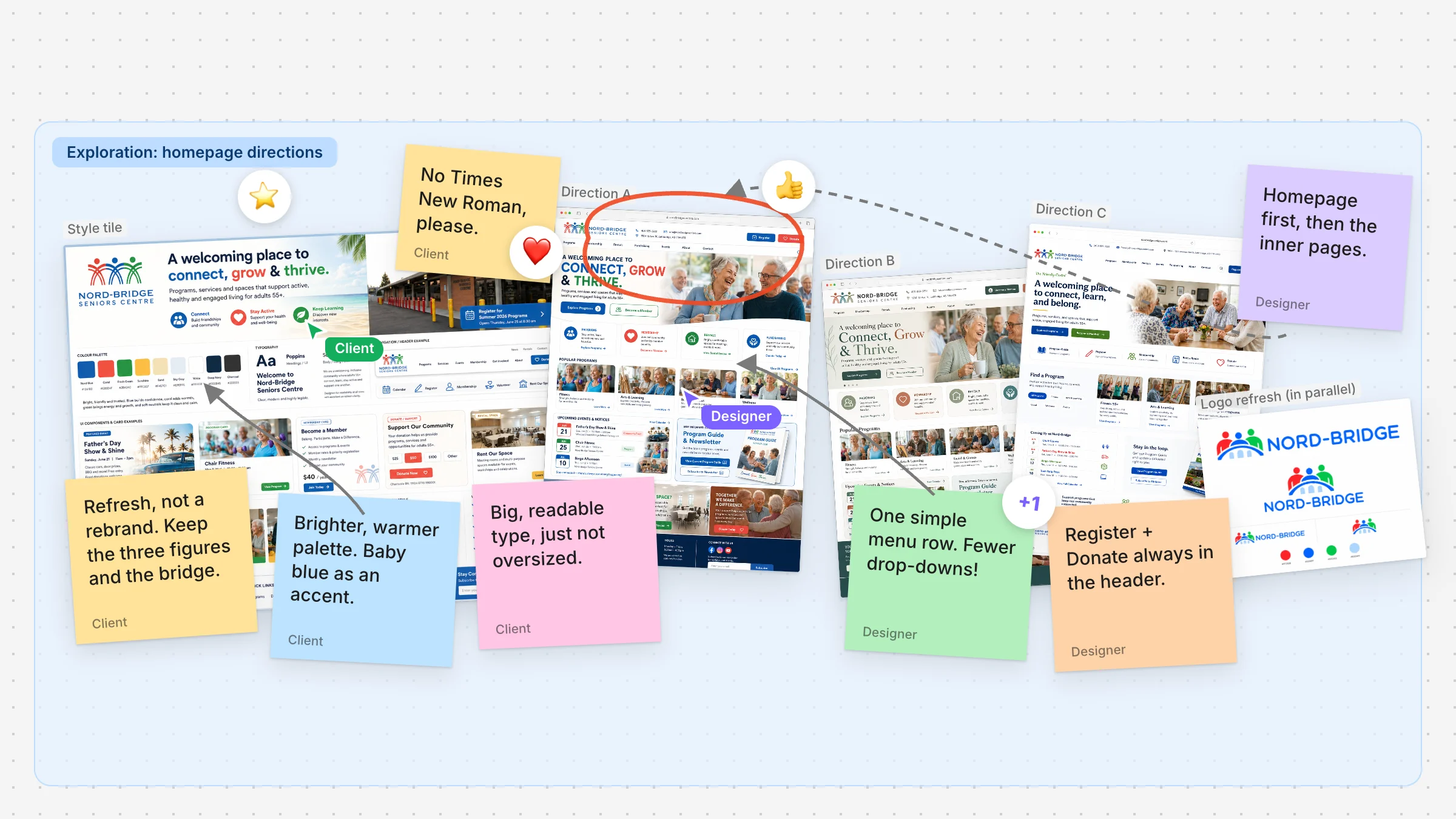
We started with a shared FigJam moodboard and a style tile, then explored three homepage directions before refining the final design. The website and logo designers worked in parallel, so the brand and the site came together at the same time, and Loom walkthroughs kept the team in the loop. Before launch we worked through about 30 final fixes from the centre’s review, then switched to nb55.ca on October 2 and forwarded the old address the same day.
Every feature serves the same goal: make the centre easier to find, easier to use on any device, and easier for staff to keep up to date.


The new NB55 website went live on October 2, 2026, and the old nordbridgeseniors.com address now forwards to nb55.ca. Drag the slider to compare the new homepage (left) with the old one (right) at the same screen width.
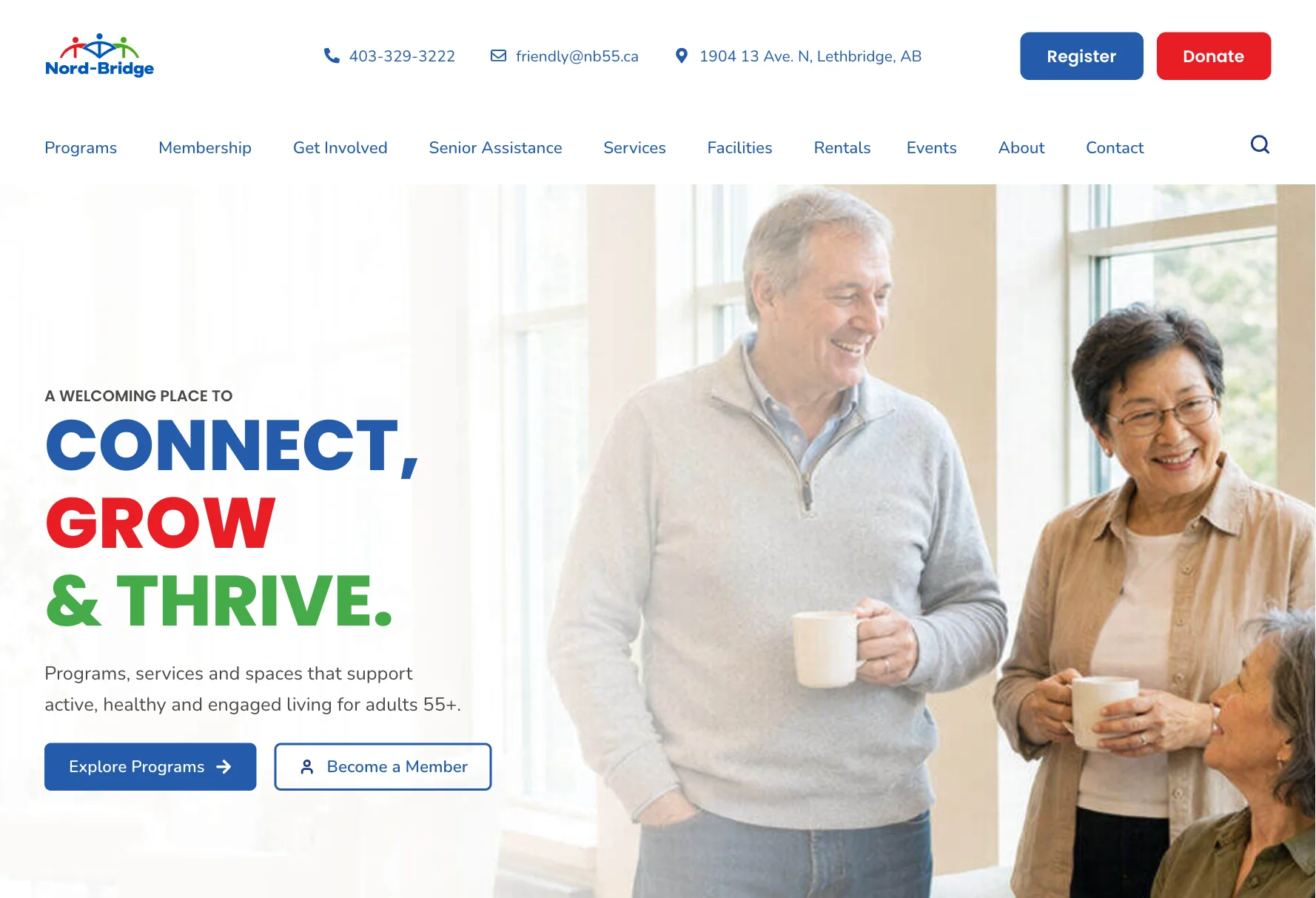
Inner pages follow the same pattern: a clear heading, plain-language descriptions, and the next step right where people expect it, whether that’s finding senior assistance, becoming a member or joining a recreation program.
On the launch call, the executive director summed up the team’s reaction:
“I’m extremely happy… it’s just so much crisper, the designs of everything, how it flows.”
A few days later, the centre left a five-star Google review that begins: “Nerdy Spider was so nice to work with while we were updating our website…” At handover, the team received a client portal with how-to guides, the brand guide and a full logo pack, so the new look stays consistent long after launch.
The new site is fast as well as clear. In a Google PageSpeed Insights desktop test of the homepage on November 22, 2026, nb55.ca scored 99 for Performance and a perfect 100 for Accessibility, Best Practices and SEO, with the main content appearing in about half a second.

Custom software, high end websites, leads for your business. We can help...


